Saturday, 17 May 2014

12 Tags of 2014 - May (It always starts with an idea)

Hello again,
I had so much fun with this month's tag.  I had an idea. Science, Medicine and Research. This tag actually coincided with National Nurses week as well. 

It started with the Laboratory paper stash, and a large #12 manilla tag and it just grew from there. Tim's tutorial this month was to encourage us to dip into our coveted stash of trinkets.  I had a cadeceus laying on my desk that I had cut out on my Silhouette. I did the faux tarnished silver technique on it.


Below you can see the tarnished silver caduceus better. The bottle is clearly for art plastic


And on to the front of the project... The Compendium of Curiosities 3challenge this time is distress glitter. Glitter, like sand, gets everywhere. I don't use it very often (with good clutzy reason). The great thing about the distress glitter is it doesn't "fly" around everywhere and is easy to clean up a whole entire jar that dumped out. Not that I would know anything about that...umm yeah, anyway.

I took the rock candy clear glitter and tinted it with Juniper alcohol ink, then I tinted the left overs with pitch black. That's such a fun technique. Tim Holtz had a tutorial on it last year. Instant any color glitter you want. Sweet.


I really didn't mean to post so many pictures, but I really like how this project turned out. I am linking it to the following challenges...
http://timholtz.com/12-tags-of-2014-may/
http://lindaledbetter.com/2014/05/cc3challenge02.html
http://www.simonsaysstampblog.com/mondaychallenge/?p=1446 ( m is for May, medical and monochromatic)


Tuesday, 6 May 2014

Compendium of Curiosities 3 Challenge

Hi everybody,

Great news! Linda Ledbetter is hosting the 3rd Compendium of Curiosities challenges. I want to play along this time. She has some great sponsors and a wonderful team to showcase each biweekly challenge taken from Tim Holtz' latest book.

This time it is sponsored by Imagination Emporium. You can check out the details here...
http://lindaledbetter.com/2014/04/cc3c01.html

Paint Marbling. Love this technique. So fun and messy and you get different results every time.
It's no secret that I am obsessed with tropical and nautical stuff, so of course, I used my new Nautical Blueprints stamps on my challenge piece. Hope you like it as much as I do.


I made 2 separate marbled sheets, one "water" one "sand".


Friday, 2 May 2014

Urban Scrapbook's May Scrapbook Page

Hi readers,

Today I want to share the May scrapbook page challenge for Urban Scapbook. You can see the other pages here...
http://urbanscrapbook.blogspot.ca/2014/05/may-2014-page-challenge.html?m=1

We were given the Basic Grey "Mon Ami" collection by Kelly Purkey to work with. I find the hardest part of the challenge, is finding an existing photo to coordinate with the papers. This month's theme was to celebrate moms or that special female person in your life. 

I edited a photo to a black and white vignette with a splash of color in the middle. The "urban skyline" background was perfect for the river valley backdrop in the photo. The picture was taken at my eldest daughter's high school graduation banquet in 2009.


Wednesday, 16 April 2014

12 Tags of 2014 - April

Hi again,

I was beyond thrilled when I saw my name at the bottom of Tim Holtz' blog post for the March tag winners. Thank you all so much for the kind comments, they are kind and appreciated. Xo

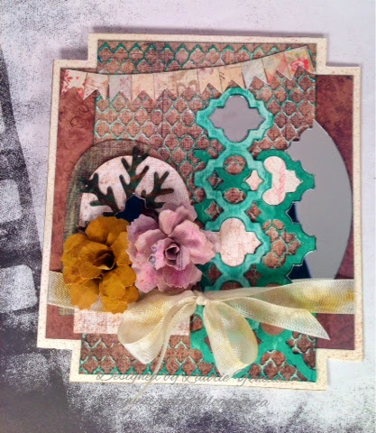
On to April's tag...I had a lot of fun playing zigsaw puzzle with the frameworks die. You DO get a lot of little pieces to play with. I had a ton of "leftovers" on my cluttered desk, so I made a card with the "scraps". 

You can check out Tim's tutorial and videos here:
http://timholtz.com/12-tags-of-2014-april/

I just love making paper roses with the tattered pinecone die. I saw the video a couple of years ago and have been making them that way ever since.

I didn't have a metal charm that Tim used on his tag, so I made my own with paper and remnant rubs.
Here is the card using "leftovers" more frameworks, pieces, mirror paper and you know those little snippets of paper that you cut off of your 12x12 patterned paper? Don't throw them away ( oh wait, we are all paper hoarders - disregard the throw away comment LOL) this little banner was perfect.
I did do the roses a little different on the card. I used the tattered floral movers and shapers die and assembled it as seen in another video by Tim.
Thanks for taking a peek, I've been seeing some absolutely brilliant tags on Pinterest inspired by this months tag. Hope you get to play tag this month too.

Sunday, 13 April 2014

Urban Scrapbook Design Team Challenge April

Hi everyone,
Our challenge this month at Urban Scrapbook was to use Gelatos, and the pretty paper line Styleboard from Crate Paper.

The background was created by doing a wash of gelatos and letting the color "run" down the paper.
The ribbon,frames,and flowers were all tinted with gelatos as well as the title letters.


You can see the shimmery shiny goodness of the gelatos on the flowers above.
I really had a lot of fun with the layout. It's my favorite picture of me and my happy Jacks.
Thanks for stopping by.

Life is Good - Enjoy the Journey

Hi again,
Simon Says Stamp Monday Challenge this week is "Journey"  This is one of my favorite themes, whether it's travel or learning, we are always on a journey to be better, to do better.
See how others incorporated the theme here:

http://www.simonsaysstampblog.com/mondaychallenge/?p=1236

So a little back story...our manager is retiring at the end of May. She has been a wonderful boss and we are going to miss her dearly. I wanted to make a retirement card for her to reflect a new journey in her lfe. After all, life is good.  It's all about perspective right?

Supplies used
Bo Bunny paper (Key Lime collection) 6x6
White textured cardstock 12x12
Glossy cardstock 12x12
Window plastic
Silhouette machine 
Plumeria print and cut file sized to 1 inch
Porthole SVG file (free download!) from SVGCuts.com sized to 51/2 inches
Ranger Archival Ink Black
Tim Holtz Distress Paint:  Weathered wood
                                       Brushed pewter
                                       Tarnished Brass
                                       Black soot
Tim Holtz Distress Inks:   Lemonade
                                       Broken China
                                       Stormy Sky
                                       Mowed Lawn
                                       Vintage Photo
                                       Walnut Stain
                                       Black Soot
Vivid inks by Clearsnap:  Apricot Ice
                                       Orange
                                       Bermuda Blue
Stampscapes palm with huts 094G
Tim Holtz stamps. simple sayings CMS155
                             Wallpaper and wood CMS126


What I love most about this is the fact that everything started out as white cardstock (except fot the teal background paper) it's all ink and paint and a fabulous stamp from Stampscapes. I love using Stampscapes and blending ink colors. Make sure you use glossy paper for vibrant results and blendability.

Saturday, 5 April 2014

Isn't She Lovely?

Hi again,
I wanted to share this card I made with you.  When I saw the Prima stamp hanging on the rack, she spoke to me. I couldn't wait to stamp the image and color it in.

I used my Copics and Shinhan Touch markers to colour and blend and blend and bl....well, you get the idea. Of course, the reason why she "spoke to me" was that the stamp seemed very tropical to me. So I added frangipanni flowers to her hair, using a memory box die in various sizes. I added a swirly flourish as well to tie in the colours .

Recognise the background paper? Upcycled packaging from the Prima packaging. I don't throw anything away. (lol)

Anything goes at Simon Says Stamp Monday Challenge this week. You can check out the link here: